Friday, April 26, 2024

Permanently Perfect

I hardly ever do perfect... Part of the reason I love the vintage grunge style of crafting is that I don't have to worry about that extra smudge. :)  The Funkie Junkie Inspiration Ave is challenging the team to use Archival inks because they are a permanent ink!  I love archival inks and the variety of colors along with the ability to not smudge and dry quickly!  

The beauty of the archival ink is the ability to use other mediums which you can blend and spray without losing the sharpness of the inked image. I also love the various colors which can be paired with watercolors to change the way the image looks.  I decided to use the same image and ink it up with three different archival inks and color the image with the same watercolor to show  how the outline ink can change your art and how it appears. 


I started with three scraps of paper that I cut into a tag shape.  I then stamped the flower with three different archival inks.  

For my next step I used a pink watercolor pencil and a water brush to add shading to the flowers. 

I loved the effect of all three flowers and how they looked different just because of the ink used on the outline stamp.  The watercolor pencil was the same for all three and yet each flower looks like they have a different shade of pink and green.  

I also used the archival ink to ink up the edges of the tag all around just create a nice crisp line.

Then I took each flower and created a different background  using a mix of distress inks, distress ink sprays, and archival inks to add texture and interest. 

On this first tag I stamped the flower on a scrap paper and cut the flower head out and laid it over my tag's flower.  I then stamped the field label using black archival ink in an alternating pattern.  I then used post it notes to mask off the rectangles to sponge in distress oxide ink in the alternating rectangles. 

I finished with a stamped sentiment which was cut and applied at different angles.  

For the next tag I used a new stencil with the same distress ink to add a little visual effect in the background of the tag. 

I could have used the mask but because I was randomly applying the distress ink, I just sponged around the flower.  

I also used a watercolor pencil (black) to add a hint of shading around my flower to make it pop from the paper.  I used a water brush to soften the shading of the black watercolor and was able to do this because the archival ink will not respond to the water brush. 

I added a hint of distress spray inks to the background and use the same effect on another piece of card-stock to stamp my sentiment and apply. 

For my final tag I wanted to use the archival ink to add the pattern to the background of the tag.

I stamped the pattern using the same archival ink.  The pattern started to take away the focus on the flowers so I smeared watered down white acrylic paint to soften the effect of the archival ink.  

I added shading again with the black watercolor pencil around the outlines of the flowers to make them really stand out.  I finished with a splatter of distress oxide stain spray spritzed onto my craft mat and picked up randomly onto my tag. 

I hope this inspired you to try out your various archival inks in a fun way.  I wanted to share with you the first thing I did when I received the new archival inks.

I always smear a solid section of the ink pad onto a scrap piece of card-stock.  (you also can use labels which already are ready to stick on your ink pad container)

Then I cut strips and tape them to the ends of my ink pads.  Because I have a wonderful ink rack my husband created for me that stores all my archival inks that looks like this: 


It makes it really easy to pick out my ink pads whether they are in the rack or stacked up on my craft desk. 

Suzz

Products:

Friday, April 12, 2024

The Flowers are Coming!

The Funkie Junkie Inspiration Ave is blooming with inspiration!  The team is highlighting flowers in anticipation of the flowers bursting open for spring!  

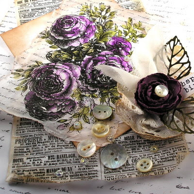
I wanted to play with my new watercolor pencils in Scorched Timber, Jet Black and White.  I decided to play around with limited color and just highlight the neutrals with the flowery images. 


I love the Stampers Anonymous Tim Holtz set Floral Trims.  They let you color away with the beautiful lined flowers. 

My goal was to see if I could use the brown, black and white watercolor to highlight the flowers and just use accent colors in the background and leaves. 

For my circular image I stamped the image using a distress ink in soft gray. I was hoping to highlight the image using watercolor pencils and shading. 

After stamping the image I used the scorched timber to add a touch of color around the petals of the flower and the green watercolor pencil in the leaves.  I then used a water brush to soften the edges of coloring. I came back with a yellow watercolor pencil to add a touch of yellow to the center of the flowers.  I used the water brush to blend that and soften the edges.

After I finished with my coloring and blending I decided to come back with the black watercolor pencil and add the lines again to the image to really make it pop.  I also shaded around the outside edges of the images with a hint of gray and blended with the water brush. 

Sometimes when I finish a project and the colors are softer and don't really pop out at me I will clear emboss the entire image.  This will make the colors richer and more intense.  I did that with this image. I sponged the entire surface after it was completely colored and covered it with clear embossing powder. I then heat set the embossing powder. Sometimes this takes two coats to get a clear finish. 

I then mounted the circle image on several circles before placing it on a black cardstock base and adding the coordinating butterfly and stamped sentiment. 

For my next experiment, I stamped the floral image with black archival ink on white cardstock.


Then I shaded and blended with the watercolor brush inside the flowers using the black watercolor pencil. I added a bit more shading with the brown watercolor pencil.  Blending each time with the water brush.  I came back and added a  heavier shading of black around the inside of the image.  

For the leaves I used the green watercolor pencils and colored around the inside and blended with the water brush.  

Next I decided to bring in pink around the outside of the flowers and a golden brown around the leaves.  I colored on the outside of the lines and then used a water brush to soften the edges and blend the color out. 

I finished the image with a black cardstock base and a stamped sentiment. 

I really wanted to use the white watercolor pencil and I tried a few different ideas and this was the one that worked most successfully.  I started with stamping the image using versamark and clear embossing powder to create an outline of the image on black cardstock.

After that I took the white watercolor pencil and shaded and blended the white inside the flower.  This made the white disappear into the black cardstock.  I came back and colored again with more pressure and further out to add more shading.  I didn't use the water brush as I wanted the white to pop off the black background in my second round of coloring.
To make the flowers really pop from the background I came back with a white gel pen and outlined the image to make is move and stand out.

Then the sentiment was stamped with Versamark watermark and heat embossed with white embossing powder.  I mounted the image on white and then a black card base. 

Not your typical spring flowers but I had fun exploring the use of white, black and browns with the flowers. 

Suzz

Products: 

Friday, March 29, 2024

Easter Joy!

 Hoppity Hi!  I am sharing a fun Easter make for The Funkie Junkie Boutique Inspiration Ave.  I used Mr. Rabbit in all his finery along with some beautiful pastel distress oxide inks!

 Mr. Rabbit is so lovingly sketched and is fun to ink up and color!  He fit perfectly as the focal point for my patchwork background.


I started by pulling out some fun stencils that I might want to use in the patchwork background along with the Mr. Rabbit stamps.

Next I dug out my pretty pastel distress oxide inks in Easter colors.

Then it was just having fun picking inks to pair with the stencils and stamps.  I cut out different sized pieces and created a soft background for the rabbit!


The bunny was colored with a hint of distress oxide inks using a waterbrush and then some additional shading was added with watercolor pencils. 

I took a sentiment that had the word hope and masked the "e" to stamp hop multiple times to add to the side of the card.  A few bunny tails and some clips helped highlight the Egg Dyes advertisement to finish off the card. 

Hoppy Spring to you! 

Suzz

Products: 

Friday, March 15, 2024

Finish It!

Hi!  I don't know about you but I have many leftovers as I like to call them cluttering up my craft desk, drawer and a few other places.  I start something and lack a finishing focal point, image, or inspiration!  The Funkie Junkie Inspiration Ave challenged us this time to finish something off that was an incomplete art project. 


I had created these beautiful shimmery backgrounds with mica stain sprays blending the colors to create a gorgeous mix of colors and then failed to use them.

Then Mr. Rabbit hopped into the house and I felt inspired to tag him!  I took one of the pieces created from this masterboard of shimmery sprays and cut it down to a tag size. 

I then stamped Mr. Rabbit using an archival ink and while it was still wet applied black embossing powder to make him really pop and hop on the background.  

Then I decided I wanted to outline and highlight him with a white gel pen.  This helped make him stand out on that strong orange background. 

I wanted to add a little whimsy to the image and decided he needed a fun bow tie and some jewelry on his floppy ear.  

I added some polka dots with some white embossing powder after stamping with Versamark randomly around the background.  

To finish it off a few black gems to his buttons and the background with a sweet sentiment.All in time for the Easter holiday coming up! 

Thanks for stopping by! 

Suzz

Products: 

Friday, March 1, 2024

Hat's Off to Men

 Howdy!  We are celebrating masculine inspired cards on The Funkie Junkie Boutique Inspiration Ave!  I started from some fun Idea-Ology Photomatic images to inspire my masculine card. 

Look at that face!  It is so inspiring and fun.  I created layers of grungy goodness to frame out Mr. Handsome. 


 The card base is from a kraft cardstock which was sponged with the lovely new Scorched Timber and sprinkled with the speckled egg distress oxide and water spots. 

The next layer is created with texture paste over a stencil which was spritzed using a mix of the scorched timber and speckled egg distress oxide.  A little water helped blend the two together.

Then a scrap of a backdrop paper sponged with a touch of the scorched timber layered  under the framed photo.

A few touches with the stamped sentiment and the numbers on the photo finished off the effect.  The embellishments of twine, die cut branch and buttons were added to create movement. 

Hop over to the Funkie Junkie Inspiration Ave for more masculine projects inspiration! 


Suzz

Products: 


Friday, February 16, 2024

Hearts & Flowers

 Hi!  Time to celebrate Valentine's with some hearts and flowers!  The Funkie Junkie Inspiration Ave team is showing off their hearts and flowers.  I was inspired by the lovebirds again!  


The lovebirds look so sweet nestled inside of the card peeking out from a larger heart framed with all the little hearts!  

The background of everything is covered with a soft pattern made from the bouquet stencil and some clear embossing powder. 

The images were created by laying the stencil over white cardstock and sponging over the stencil with versamark watermark ink.  Then covering the ink with clear embossing powder and shaking off the excess.  Then heat up the embossing powder until it melts completely.  

After that The hearts and birds were cut from the embossed paper and the card base was formed from the embossed paper.  The heart was handdrawn and cut out from the center of the card front. 

The hearts were layered around the edges of cut out heart and the birds were placed inside.  The single pink heart was sprayed with mica stain spray and placed over their hearts. 

My first heart card started with texture paste and mica stain sprayed over the surface and it was striking but didn't pop with the smaller hearts so this card base will have to wait until I get additional coordinating hearts ready for it!

Next I played with many hearts sprayed in beautiful shiny mica stain sprays and paired them with a pink heart placed on the front of the card.

This was just a smattering of purple and yellow hearts over the pink heart and some sweet lovebirds paired with the hearts.


Three different cards all using the lovebirds and hearts for inspiration!  

Suzz

Products: 

Friday, February 2, 2024

Steampunk Lovebirds

Hi!  The design team at The Funkie Junkie Inspiration Ave is showcasing the latest Sizzix Release by Tim Holtz called Out of the Vault!  I was lucky enough to receive the beautiful LoveBirds! 

I decided to stamp up my die cuts to add a pop of texture to the surface.  I created a flock of birds before I realized what I wanted to use on my card.

I cut the birds from inky backgrounds and using the Idea-Ology Tim Holtz Backdrops.  I spritzed the backgrounds using the same colors I used on the card.  They were a mix of Seasonal Distress Mica Stains along with a distress oxide. 
The backgrounds were created by first applying a layer of opaque crackle texture paste over the flourish stencil. This was done on the backdrops paper and white cardstock.


 While the crackle paste was wet the sprays were sprayed multiple times along with water to help mix the colors and thin out in areas the density of the color.  Then a heat gun was used to dry out the crackle paste.  There was a mix of some areas crackling and others not because of the wetness when applied. 

After that the background was cut for the card from one of the pieces.  Then the birds were stamped using black archival ink with the various images on some inky remnants.  The birds and feather were covered in versamark ink and then a layer of clear embossing powder heated up.  This made the colors more vibrant and added another pop to the color on the cut out images. 

Happy inking! 

Suzz

Products: 

Friday, January 19, 2024

It's Cold Outside!

We are definitely feeling the cold this week!  We are sitting at -31 degrees with the windchill. Perfect time to sit inside and craft a bit!  The Funkie Junkie Boutique design team is showing off their cold likes and dislikes at The Funkie Junkie Inspiration Ave.  I was inspired by frosted windows that had such beautiful crystalized designs.  I wondered if I could emulate that with the Frosted Crystal Embossing Medium from Tim Holtz/Ranger. 


To create a frosted pane: 

  1. Start with a heat resistant acetate sheet. 
  2. Sponge over the stencil with Versamark ink. To get your pattern onto the acetate. 
  3. Sprinkle with the Frosted Crystal. 
  4. Heat up the embossing powder until the crystal shows.  (Don't overheat as eventually the crystal will melt and you will just have a clear embossed image) 

The frame on the cardstock was created with the same process. 

  1.  Lay the stencil over the front of the card. 
  2. Sponge on the Versamark ink. 
  3. Repeat pattern until front of the card is covered with inky pattern. 
  4. Sprinkle with Frosted Crystal. Shake off excess. 
  5. Heat up the embossing powder. 
  6. Smear gold wax over surface to create highlights.

Then cut out the inside of the card base and use for the additional layering on top.  I also used a bit of the excess from the middle to die cut the bird to place on the front of the card. 

I loved the effect of the Frosted Crystal and decided to try the same process on white cardstock. 


The tag was created by: 

  1. Sponge versamark ink through the stencil onto the white cardstock. 
  2. Repeat until surface area is covered. 
  3. Sprinkle Crystal Frost Embossing powder over surface.  Shake off excess. 
  4. Heat until the frosty effect occurs. 
  5. Spray with a mix of distress oxide and micas stain sprays. 
  6. Spritz with water to lighten the effect and dab with paper towels to take off excess ink.
 The next panel was made with translucent embossing paste.


To create the snowy effect: 

  1. Lay stencil over heat resistant acetate. 
  2. Use spatula with translucent embossing paste and apply to acetate. 
  3. Repeat until covered with snowflakes. 
  4. Sprinkle Frosted Crystal Embossing medium over surface and tap off excess. 
  5. Some will cling to the acetate.  (I used a fine tip brush to brush off the excess) 
  6. Heat emboss the snowflakes and the embossing paste.  The embossing paste will puff up which gives it an additional layer of texture. 
  7. I wanted a full frosty panel so I took one more step of inking up the complete reverse side with Versamark and applying the Frosted Crystal Embossing Medium over the entire surface and then heated it up. 

This panel looked like a frosted pane of glass and was very cool!  

Keep warm! 

Suzz

Products: 

Friday, January 5, 2024

2023 Favorites!

Hi!  I am sharing my favorite from 2023!  I loved the Floral Trims from Stampers Anonymous Tim Holtz and did a series of tags with it earlier this year but wanted to bring it back out and play with it one more time! 

 This is a multi-layered card using the floral trims stamps.  First the stamp was stamped on white cardstock with black ink.

The background was sponged with black dye ink around the images.  Then splatter the background with white paint.  

Stamp the flowers again on tissue paper and white cardstock using black archival ink.

Color the images with watercolor pencils and blend with a water brush on both the white cardstock and tissue paper.  Heat set the colors on the images.


Cover the entire  colored image with versamark watermark ink.  Apply clear embossing powder over the tissue paper and  heat emboss until the embossing powder completely melts.

Cut out the flowers as a complete image from the white cardstock and apply to the black sponged inky background.  Cut out the flower petals and leaves from the transparent colored image to apply over the images on the cardbase.

This will give the card a layered 3 dimensional effect. 

 Suzz

Products: