

Hello! Today is a new challenge at The Funkie Junkie Boutique Challenge. It is hosted by the talented Lisa and she is challenging us to be inspired by A Study in Contrasts!
Her description:
"The seasons are changing and the cold greys and browns of winter are giving way to the warm greens and colors of spring! For your challenge highlight contrasts in your projects. It could be themes, colors, textures or forms. We are looking forward to your creative interpretations and juxtapositions of things that are contrasting!"
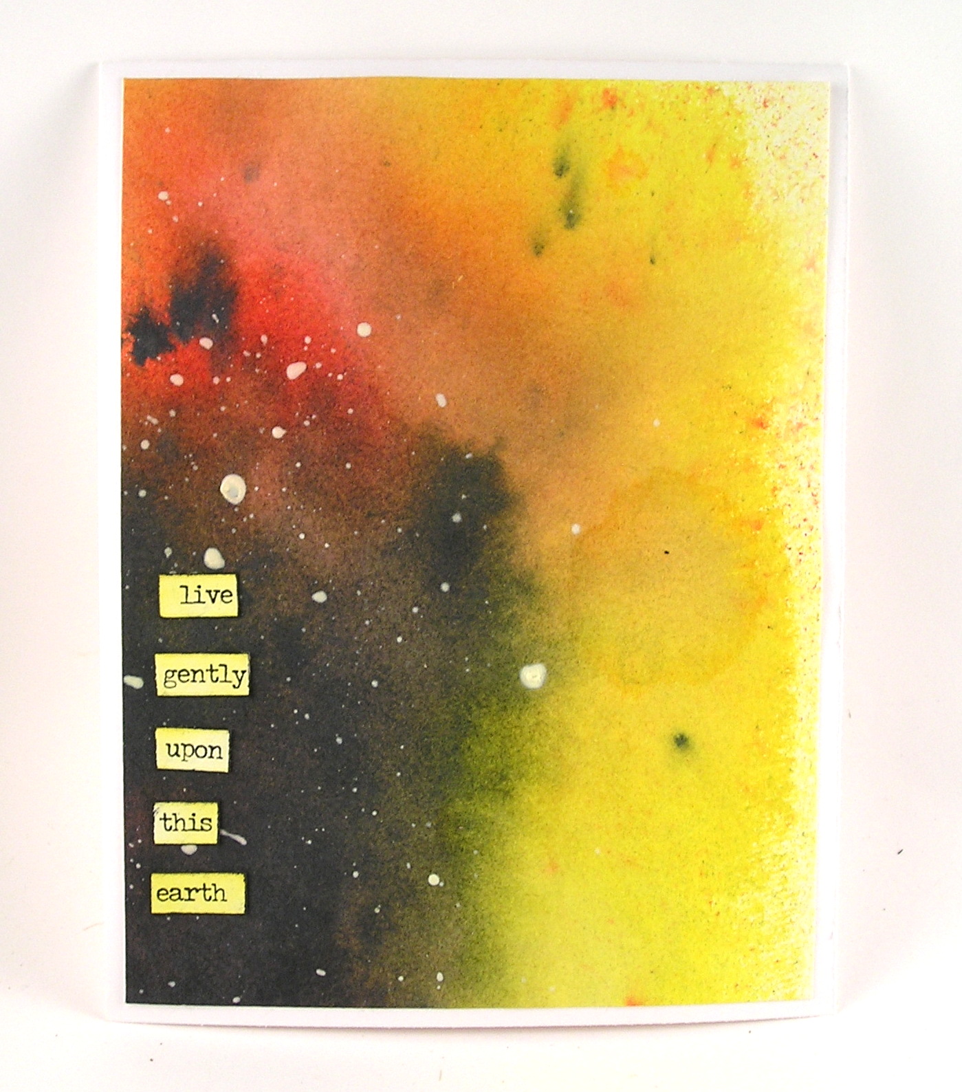
I have been recently reading the book The Book of Hope - A survival guide for Trying Times - by Jane Goodall and Douglas Abrams. In it they discuss hope and here is a direct quote from their conversation: "There is a lot of darkness, but our actions create the light. (Jane Goodall) "So it seems we can shift our perspective to see the light and also to work to create more of it.(Doug Abrams)" This inspired me of how hope is a light in times of darkness.
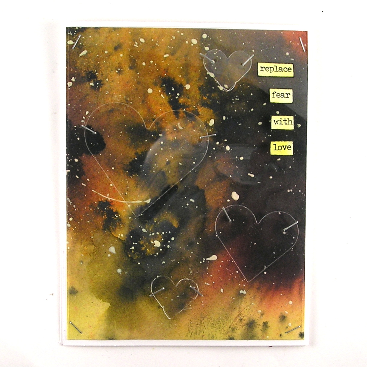
I used that idea to start with light and show how darkness can spread as well as light.


The power of the water added to the dark or light colors makes them spread exponentially.
In the Wrinkle in Time - Madeleine L'Engle said “A book, too, can be a star, “explosive material, capable of stirring up fresh life endlessly,” a living fire to lighten the darkness, leading out into the expanding universe.”
I started with one large sheet of mixed media cardstock. I sprayed a yellow background across the paper.


Please come share your contrasting art with us at The Funkie Junkie Boutique Challenge! The overall winner will be offered the chance to be a Guest Designer at a future date at The Funkie Junkie Boutique Blog, and everyone who enters and follows the rules will go into the drawing for the chance to win a $25.00 spending spree at The Funkie Junkie Boutique. There are also Top 3 Badges for three additional outstanding entries, chosen by the Design Team.
Sending you light and hope.
Suzz
Products:
- Ranger Distress Oxide Spray - Black Soot
- Ranger Distress Ink Spray - Squeezed Lemonade
- Ranger Distress Ink Spray - Mustard Seed
- Ranger Distress Ink Spray - Barn Door
- Ranger Dylusions White Linen Paint
- Idea-Ology Tim Holtz Metallic Stickers
- Acetate
- Sizzix Dies Stars
- Sizzix Tim Holtz Chapter 1 Stacking Hearts
- Idea-Ology - Tiny Attacher
- Idea-Ology Tiny Attacher Re-fill

Your cards are so awesome! I love those backgrounds! :)
ReplyDeleteThese are really amazing! You always think outside the box, and I love the way the acetate livens up those almost celestial backgrounds! Well done, again, Suzz!
ReplyDelete