Here is how Sara Emily describes the challenge:
"We're seeing a lot of pastel and brighter colors this time of year. For this challenge we're inviting you to step away from all that color and play with your neutral art supplies. You can add a few pops or hints of color, but be sure we see mainly neutrals on your vintage or shabby chic design. (Think black, white, gray, brown, beige, cream, ivory; even gold and silver.)"
Neutrals? Black, White, Gray, Gold, tan, Brown? I am totally in...
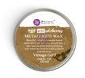
I loved the idea of the neutrals and pulled out all my black, brown, gold and even deep blue inks, sprays, and paints to get started!
I started with an old journal page that I decided to embellish with inky goodness.
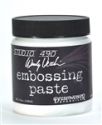
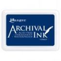
I added a strip of text stamped along the left side in a deep blue. I then embossed with white embossing paste the plaid pattern. I spritzed black spray over sections of the background including some flicks and splatters. After that all dried I came back with white paint splatter and used bottle tops and bottoms of pens to add circles with white paint.
I let that sit for a few days and then created my first card with the layered image, die cuts and embellishments.
I hope you are inspired to pull out your neutral colors and play along with us!
The winner will earn the chance of a Guest Designer spot here at Frilly and Funkie, and everyone who enters and follows the rules will go into the draw for the chance to win a $25 spending spree at The Funkie Junkie Boutique. And there are Top 3 Badges for three further outstanding entries, chosen by the Design Team.
Thanks for stopping by!
Suzz


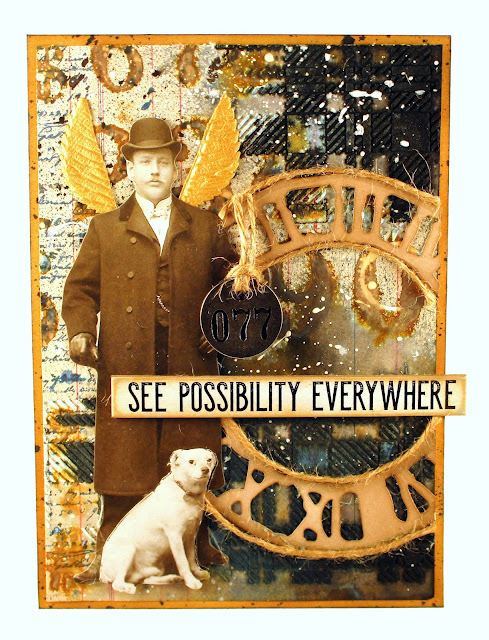






Suzz, that background is a mixed media dream and the way you transformed it into this awesome card is most inspiring and creative! I'm crazy over your neutral mix of colors and awesome style. Hugs, Autumn
ReplyDeleteSuzz, I'm not sure what I want to comment on first! I LOVE it all, but that background has my head buzzing with excitement! It is so fun to learn how that came together and the fact you started with an old journal page! Amazing how it looks with that gent and clock layered atop! Using the twine to outline the clock is a brilliant creative move and using a leaf for wings--genius! Whenever I leave your blog, I think 'why didn't I think of that?" Because Suzz is the genius here, that's why! I am in love with your neutral colors and design, and you have outdone yourself with this! Hugs!
ReplyDeleteLove this design Suzz. The colours and composition are fabulous. Thank you for the inspiration. Creative hugs, J x
ReplyDeleteThe background is amazing! But my favorite is the leaf wings. So whimsical. You are a stamping/inking genius!
ReplyDeleteWhat a fabulous background Suzz!!! You've transformed that ledger sheet to make it the perfect backdrop for any card and then taken it to another level with the die cut clock and adornments. Absolutely gorgeous! xx
ReplyDeleteYour background is Amazing! I love the shot of just your background piece before you added it to your card. So much going on. Love it, Suzz!
ReplyDeleteKate