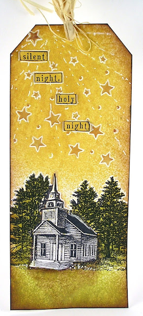
I tried about 5 versions of the rays and stars stenciled in various colors and materials. I ended up using this tag where I started with a stencil that had very thin rays which I sprayed over onto the tag with the yellow sprays. I then stenciled the stars over the top with white embossing paste.
Then onto my next problem no trees the right size for the tag. I almost bought the cool tree dies that Linda used but I ended up using my money elsewhere. :( So I dug through my stamps looking for something to stamp beneath my lovely sky. I found this Stampscapes scene which I used to stamp along the bottom. I finished off with some more spray in a lovely green color. I added more highlights/shading to finish of the tag.
I then used my Fossilized Amber Dye Ink pad to sponge in a large moon on the background. I wanted to try using the Ken Oliver's Color Bursts to create flowers.
I sponged in my moon with a mix of the yellow, orange, and brown dye inks. After I finished that I stamped in the stems of my flowers. I then very carefully tried to squeeze a little of the powder around the ends of the stems. I then spritzed with water to activate the colors. (This was my third version) Each time the powders ended up a little different.
Well that is all I have to share today!
Suzz


Love the way your sky came out - I like the thin rays much better than the ones on my piece. And the peaceful country scene with the country church is perfect. Another wonderful entry into the Chrismas tags challenge.
ReplyDeleteHugs,
Linda
Ohhhhhh love the magic of that light!!
ReplyDeleteHi Suzz!! Thanks so much for stopping by my blog and leaving such a nice comment. That was very sweet of you! I had to check out your blog and glad I did! Your Christmas tag for Funkie Junkie's 12 tags of Christmas is really pretty. Love the church in the midst of all that Fossilized Amber! And you card with the moon and the flowers is awesome! LOVE how you used Ken's Color Bursts on the flowers! Neat idea!
ReplyDeleteLovely tag Suzz! x
ReplyDeleteI love that your tag appears so opposite from Linda's in regards to the prevalent background color, but it's so beautiful how you captured all her colors and concepts. The church is a wonderful addition. I really like what you made here.
ReplyDeleteI love that your tag appears so opposite from Linda's in regards to the prevalent background color, but it's so beautiful how you captured all her colors and concepts. The church is a wonderful addition. I really like what you made here.
ReplyDeleteOh how very pretty is this!
ReplyDelete