Friday, July 29, 2016

See the Light

Happy Friday!  Things have been a whirlwind here with my day job and family activities. My poor craft room might even be gathering dust!  (The only room in the house that usually doesn't collect any. :)

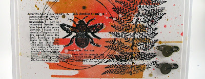
I saw something on pinterest today which peaked my interest and this project was inspired by an idea of how to re-create the effect.
The project on pinterest was a layout which looked like stripes of color behind a photograph.  That had me thinking how I could create a faux tissue tape of color. 
Here is how I achieved the stripes of color in the background or my faux washi tape:
 I took a piece of cardstock and cut it to the approximate size I wanted my background. (I ended up cutting it down further after I finished stamping and everything else)

I used tissue tape and tore it up to give me rough edges.  I framed the edges of the cardstock with tissue tape.  I put two full length strip of tissue tape on the sides to keep a clean edge.  Along the top and bottom I added layers of torn tissue tape to create the faux tape edges.

I left a few gaps in between the pieces along the top and bottom to allow a bit of color to seep through.  I then came back with a thinner tissue tape and taped off a few stripes in the middle. I would have liked even a thinner strip but was pleased with the end result.

After all the tape was laid out I just started sponging in the different distress inks to get a variety of colors blended together.  (Worn Lipstick, Festive Berries, Antique Linen, Fossilized Amber)

After I was happy with my colors I pulled up all the tape. Now I had a background for my stamping.  I also took a few pieces of tissue tape and went the other direction and tore pieces to apply on the background.
 I added splatters of the distress inks and some paint in the background to add additional colors and spots.
I hope you have a fabulous weekend!

Suzz

Friday, July 22, 2016

Golden Sea

Hi!  I have had a wonderful week playing with these projects.  I knew I wanted to do a second creation for A Vintage Journey's Monochromatic challenge.  I was thinking about what inspires me and decided on a golden color scheme.

I started pulling out all of my golden mediums (I had quite a few!)  and thought how could I incorporate all those beautiful golden textures and I thought of the Sea-Horse die and how splendiforous he would be in golden colors with golden textures.  He also is perfect for the Anything But Cute - Summertime Fun and the Mixed Media World MMW16# - Under  the Sea
I started creating lots of glittery golden textured sea-horses.  I began with a gold background on a journal page and inking up lace, ribbon and other bits.  I layered this all on the journal page.  As I was doing that I had this clear idea of a card that would be cleaner in design but use the same elements.

I used the vesafine toffee to stamp the beautiful sentiment and the script.   I then die cut the seaweed and sprayed with the gold die.  I sprinkled the Stampendous Gold Luxe Mix over a strip of glue I pooled on the paper. 

Then I continued on with my canvas.

(Click on this to see the details!)
Here is a close up of the sandy bottom.  I glued sand on the bottom and let that dry and then covered it in spray of gold ink. I mixed in some more Stampendous Luxe, golden shells and piles of more sand.

Products: Verses Rubber Stamps - Salt of the Ocean, Stampendous Gold Luxe, Heidi Swapp - Color Shine (Gold Lame), Rangers - Paint Gold, Recollections - Gold Embellishments, Yvonne Blair - Impression Obsession, Versafine - Toffee, Sizzix - Seahorse, Sizzix - Seaweed

I had such fun with this project although I am still sparkling from the glitter!

Have a beautiful day!

Suzz


Wednesday, July 20, 2016

All Lined Up

It's Funkie Time!  The Funkie half of the Frilly and Funkie DT is sharing our creations for the current "All Lined Up Challenge".   The challenge is hosted by the fabulous Jenny and she gave us the following guidance:  For this one we need you need to think in straight lines! Be it rows or columns, stripes or even grids make sure those vertical and/or horizontal lines or rows of things are a clearly visible part of your vintage or shabby chic projects (the edges don't count!)

At the end of the challenge the team will choose their top four picks. Our first place winner will be invited to join us in a Guest DT spot here at Frilly and Funkie. Three additional talented participants will receive badges to display on their blogs. Everyone who enters and adheres to the challenge guidelines will be entered into a drawing to win a $25 spending spree at The Funkie Junkie Boutique!

I played around quite a bit with this challenge and came up with two pieces of art and several different backgrounds.

This was my second card but I love it because I tried something new and loved how it turned out.


I used a ruler with a baby wipe folded up and attached to the ruler edge to use as a stamp.

After I had attached the baby wipe I ran the edge with the wipe over my distress ink pad to ink it up. I then used that edge to stamp the paper.  When stamping the paper you need to hold the inky part down and either stamp it directly or run it back and forth to get a stronger imprint.  You can also wiggle it around to give it a softer edge on the line.
I did one batch of yellow lines and then inked up with the darker color of brown lines.  You can see these lines are much softer and this was with very little ink on the ruler.  To get stronger lines you add more ink to the baby wipe.


I had fun with my lines and decided to create a plaid version of the lines.  I also increased the amount of ink on the ruler by inking up multiple times and angling the ruler to get ink on both sides of the edge.

On my card I used the faintest lines and went back over with a stencil where I masked off one row of circles.
I added a soft doily stamped in the background and then used the chipboard pocketwatch frame to frame out an image.  I added the beautiful metal butterfly to the watch with a bunch of flowers and a touch of lace.

For my second project I went with the row of circles again.


I inked up the circles with the yellow ink and dabbed on a touch of the brown and then stamped them across the card. I repeated until I had covered the bottom half of the card.  I then thought it would be fun to link them together so I  used a colored pencil to trace a line across the rows.

I wanted a color combination of yellow, brown and a pop of red.  I looked around and saw the lovely poppies from Wendy Vecchi.

I stamped a bouquet of them and then dragged the inkpad right over the top of them to get the richest color on the flowers. I blended it with a sponge after I had inked them up.

I then died some thread with the yellow ink and created baby pom poms to put in the center of the flowers.  I also stamped the leaves and covered them in brown ink and separated them to create a few for the background with the lovely metallic ribbon.

Don't forget to check out the  Frilly and Funkie blog to see the rest of the Design Team's awesome creations.

Suzz


Monday, July 18, 2016

Golden Summer

Hello!  I am back finally with a quick card for the Monochromatic challenge at A Vintage Journey.  I am working on a second monochromatic card. (So stay tuned)  This also reflects how our summer fun happens around here. Lot's of outside gardening with many birds chirping and sharing their nests in our trees.  The Anything But Cute Challenge is Summer Fun.


The birds are cooing, singing, chirping and crowing all night and day around here.  It starts in the spring and continues through the summer. 

I decided that  yellow was a happy color to use for my monochromatic colors.  I started with the mini stencil and sprayed a mix of the mustard seed, squeezed lemonade, fossilized amber over the stencil to get my fun circles. I then stamped the bird and colored with the same spray colors.  I have pieces of bark off the trees on my desk in a bowl and thought it would be fun to use behind the bird.

Thanks for stopping by!

Suzz
Photos:


Tuesday, July 12, 2016

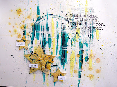
Wish upon a star

I was in a hurry to finish up a journal page that I started awhile ago for the Words & Paintery June Challenge.   I also mixed in circles and stars because of the Mixed Media Monthly - Reach for the Stars and the Country View Challenge to use Circles


I started with using the edge of the acrylic block and running it through acrylic paints.  I dragged them down the mixed media cardstock to create streaks of paint. 


 After that I wanted a focal point so I created a big circle by dipping in paint the bottom of a pail sitting on my desk.  I repeated a couple times to give multiple circles.   I added lots of splattering over the background with the same paints.


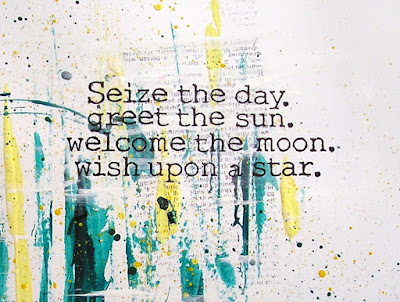
 I then pulled out this sentiment from Yvonne Blair/Impression Obsession and stamped it on tissue paper to put over the top of my background with decoupage medium.  I stamped a fine text randomly in the background which includes the definition of dreams.

I used crackle embossing paste to add a smattering of small stars in the corner and waited for them to dry and sprayed them with distress stain spray.  Then it sat for a week while I tried to think what I wanted to use to add layering.  I decided on die cut stars to layer and ink up in coordinating colors.

Products: PaperArtsy Fresco Paints, Memory Box - Stars Stencil, Memory Box - Dreams Stamp, Sizzix Stars, Impression Obsession - Yvonne Blair - Sentiment, Idea-Ology - Chit Chat Stickers


Thanks for stopping by!

Suzz

Photos:


Friday, July 8, 2016

Tag Love

Welcome.  I have been having a bit of a challenge with Tim's tag for this month.  He created a beautiful tag mixing up two of his techniques.
He used a glaze resist and a layered die cut technique.  The glaze I have had but hadn't used for anything before. I was happy to pull it out and experiment. 
I couldn't quite get what I had imagined in my mind onto the tags and tried two color variations and different techniques to apply the glaze. 

The glaze goes on like Vaseline and will create a slick moist coverage and prevent anything from soaking into the image.  Because it is like Vaseline a lot of it goes a long way.  You only need a tiny bit which gets spread around.  Also as you can see around the head and along the bottom that using your fingers on a fine detail doesn't work you need a pencil tipped applicator. I even had a third attempt that I didn't share here where I used an eye shadow applicator which still didn't keep it applied closely.  For the purple image I used a tool intended for blending colored pencils.

I love the idea of the glaze and am going to keep playing around to see if I can achieve some different effects.

Have a lovely Friday!

Suzz